Open one of our templates and you’ll see one column of dark text on white, real headings and not much else. That’s on purpose. It doesn’t mean accessible documents have to look plain. It means these templates are built for one job: getting the information to the people who need it, every time someone fills them in.
What the plain look is for
It holds up when your content replaces ours. A template gets filled in dozens of times, by different people, under deadline. Titles run longer than the sample. Agenda items get added. Someone pastes in a paragraph from last year’s report. A layout built from text boxes and shapes looks fine with the sample text and comes apart with yours. Text that flows in one column just gets longer.
Screen readers read it in the right order. Text boxes, floating pictures and shapes sit outside the normal flow of the document, and screen readers can read them out of order, or skip them. That’s why designed cover pages are risky: they’re usually shapes and text boxes over a picture, and the title often isn’t a real heading at all. Our report opens with its title as a heading instead.
It survives Word for the web and Google Docs. A lot of people edit in a browser now. The fancier the layout, the more likely it shifts or breaks when someone opens it there. Every one of our template files is checked in both.
It gets changed in one place. Headings use Word’s built-in styles. If you want them bigger, or in your organization’s color, you change the style once and every heading follows. Compare that with the usual way documents get made: open last month’s file, change the date, and carry forward every formatting problem it had.
The instructions aren’t in the template. Templates often come with “Insert your text here” notes and tips in the margins. Those get posted. Ours have only placeholders in [square brackets]. The guidance lives in a separate “Read me first” file in each kit.
See it filled in
The best way to judge a plain template is with real content in it. Each kit page shows a filled-in sample for the Town of Alder Bend, a made-up town. The only thing the sample adds to the template is a logo.
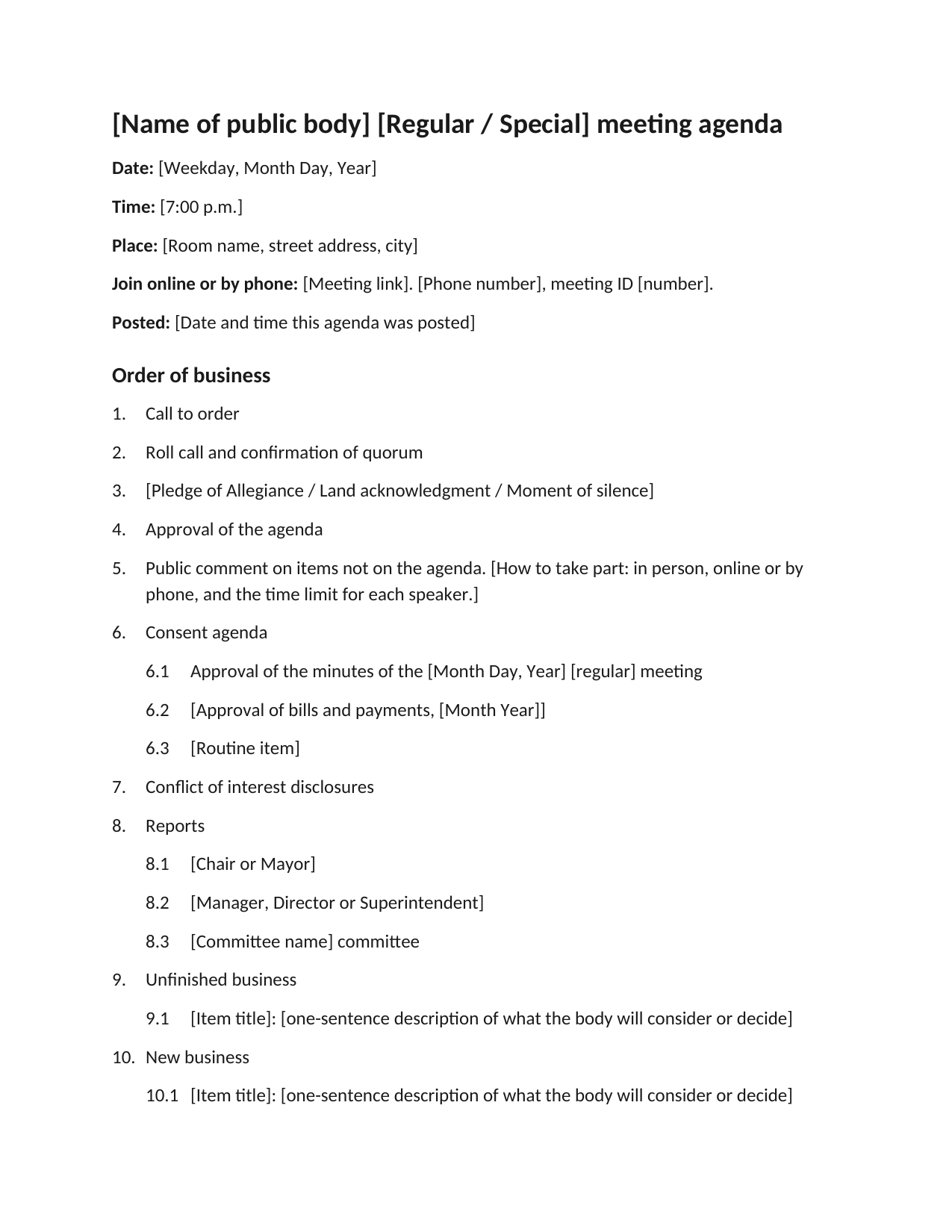
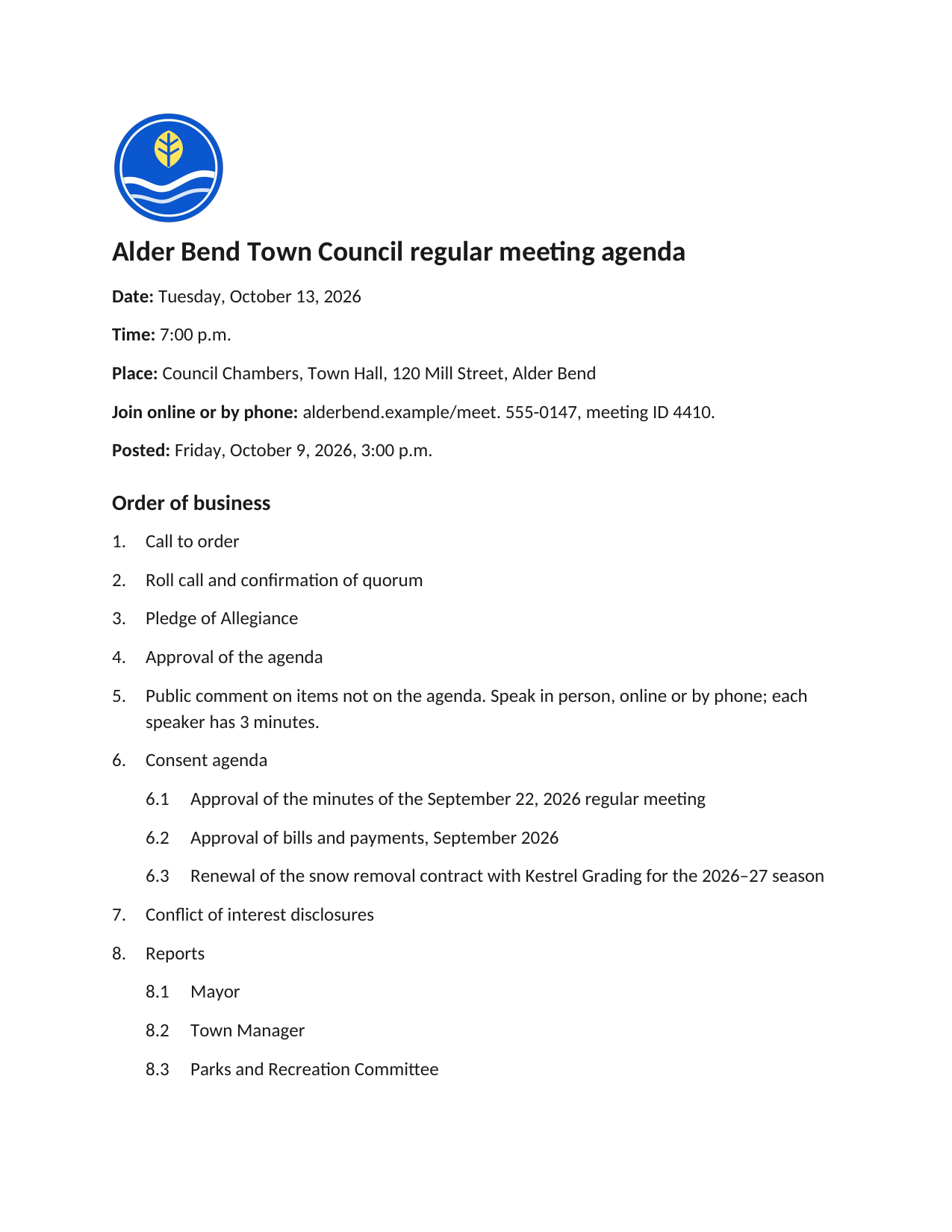
The meeting agenda template, and the same template filled in for Alder Bend. Select either page to see it full size.
The pages show: The template: a heading with placeholders for the name of the public body, lines for the date, time, place, how to join and when it was posted, then a numbered order of business, and sections for accessibility and accommodations, language assistance, meeting materials. The sample: The town's round logo, then the heading “Alder Bend Town Council regular meeting agenda”, the date, time, place and how to join, and a numbered order of business with sub-items for the consent agenda and reports.
Where to add your own look
Your logo. Put it at the top, in line with the text (in Word: select the picture, then Layout Options, In Line with Text). Don’t let it float. Give it alt text: your organization’s name is usually enough.
Color. The notice kit’s flyer and closure notice have a colored band behind the title. You can change its color, but the title text is white, so the band must be dark. Check that white text on your color has a contrast ratio of at least 4.5 to 1 with WebAIM’s free contrast checker. Colors that work include dark green (1E6B34), dark red (A4262C) and purple (5B2C83). Orange, yellow and light green don’t.
A picture. A photo from last year’s event can help a flyer. Keep it in line with the text and give it alt text that says what it shows. Never put the date, time or place only in a picture: they must be in the text as well.
Fonts and sizes. Change them in the style, not one heading at a time. Pick a font that’s easy to read at a glance, and keep body text at 12 point or more.
After any of these changes, run Word’s accessibility checker again (Review, Check Accessibility), and read the document through once more. Our document accessibility checklist covers what the checker can’t.
When to start somewhere else
If you’re making a glossy brochure or a designed annual report, these templates aren’t the right starting point. That kind of layout is worth doing with a designer, and it takes more accessibility work, not less: every text box and image has to be checked for reading order and alt text, often in the PDF as well.
For an agenda, a public notice, a policy or a report people need to read and act on, simple is the point.